
COVID-19 Tracker Indonesia
How is your province doing? Has it passed the peak of new cases?
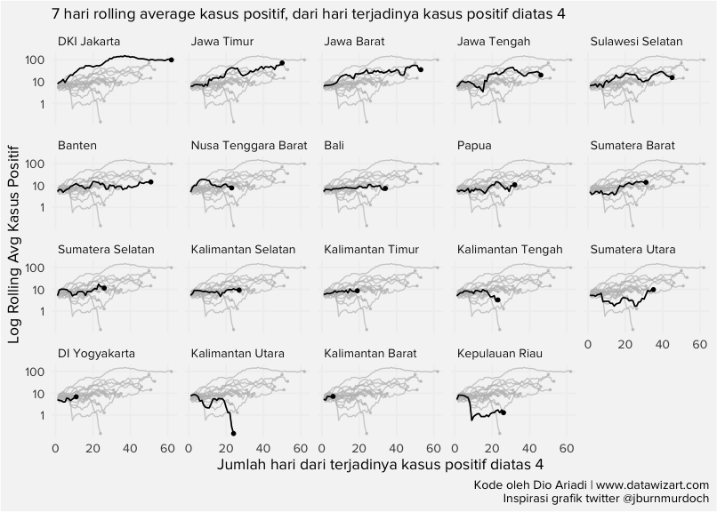
To answer that, we built three charts, each of which can be used to read Covid-19 cases across Indonesia’s 34 provinces. All three show the 7-day rolling average of positive Covid-19 cases in each province. The first and second replicate the dashboard built by the Financial Times link. The third replicates the heatmap from the Twitter account @VictimOfMaths source. The three complement each other; each has its own strengths and weaknesses. Showing all three should be enough to support a reasonable reading.
Disclaimer: the author only builds the charts and draws no conclusions from them.
Time series: rolling average of new positive cases
NOTE: in this first chart, each province’s rolling average is drawn as a single time-series line, which makes province-to-province comparison easier. The rolling average starts once a province has reached 4 or more cases.
Code
heatmap_daily_indo %>% group_by(province) %>%
  mutate(dott_y = if_else(seq_==max(seq_),casesroll_avg,NaN)) %>%
  ungroup() %>%
  ggplot(aes(x=seq_ ,group=province ))+
  geom_line(aes( y = casesroll_avg))+
  geom_point(aes(y = dott_y),size=1)+
  gghighlight(use_direct_label = FALSE,unhighlighted_params = list(size=0.4))+
  scale_y_continuous(trans='log2',
                     breaks=c(1,10,100,500,1000,5000,10000,25000,80000,120000))+
  facet_wrap(~province)+
  labs(subtitle = "7-day rolling average of positive cases, from the day a province passed 4 cases",
       y = "Log Rolling Avg Kasus Positif",
       x = "Jumlah hari dari terjadinya kasus positif diatas 4",
       caption = "Kode oleh Dio Ariadi | www.datawizart.co\nInspirasi grafik twitter @jburnmurdoch")+
  theme(panel.background = element_rect(fill = "#f5f5f5"),
        text = element_text(family = "Proxima Nova"),
        panel.grid.major = element_line(colour = "#f0f0f0"),
        panel.grid.minor = element_blank(),
        axis.ticks = element_blank(),
        strip.background = element_rect(fill = "#f5f5f5"),
        plot.background = element_rect(fill = "#f5f5f5"),
strip.text.x = element_text(hjust = 0))7-Day Rolling Average by Province
7-day rolling average of positive cases, from the day a province passed 4 cases
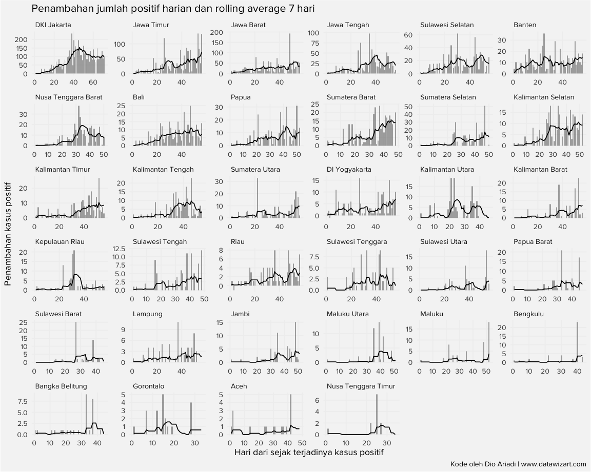
Time series: daily positive cases and the 7-day rolling average
The second chart shows each province’s case growth in more detail. Alongside the line for the rolling average, it uses bars for the number of positive cases per day in that province. That makes it easy to see exactly which day a province peaked.
Code
heatmap_indo %>% filter(total_case>0 & province!="no_define") %>%
  arrange(data_date) %>%
  group_by(province) %>%
  mutate(seq_=row_number()) %>%
  ungroup() %>%
  ggplot(aes(x=seq_))+
  geom_col(aes(y = daily_case),alpha=0.5)+
  geom_line(aes(y = casesroll_avg))+
  labs(title = "Penambahan jumlah positif harian dan rolling average 7 hari",
       subtile = "Bar adalah penambahan harian, line adalah rolling avg",
       x = "Hari dari sejak terjadinya kasus positif",
       y = "Penambahan kasus positif",
       caption = "Kode oleh Dio Ariadi | www.datawizart.co")+
  facet_wrap(~province,scales = "free")+
  theme(panel.background = element_rect(fill = "#f5f5f5"),
        text = element_text(family = "Proxima Nova"),
        panel.grid.major = element_line(colour = "#f0f0f0"),
        panel.grid.minor = element_blank(),
        axis.ticks = element_blank(),
        strip.background = element_rect(fill = "#f5f5f5"),
        plot.background = element_rect(fill = "#f5f5f5"),
strip.text.x = element_text(hjust = 0))Daily Cases and Rolling Average by Province
Bars are daily cases; the line is the 7-day rolling average
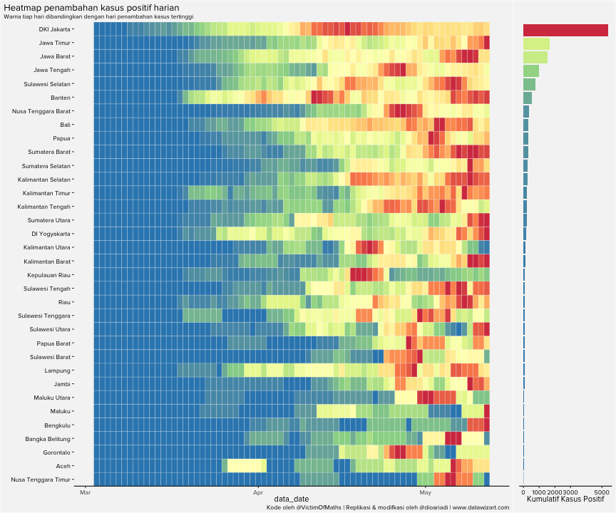
Heatmap by province
This heatmap shows the 7-day rolling average of new positive cases, normalised against each province’s own highest case count. The greener a province’s row, the further its rolling average has moved from that peak — which can be read as the province having passed the peak of new cases.
Code
heatmap_indo_2 <- heatmap_indo %>% filter(province!="no_define")
heatmap_indo_2$province <- fct_reorder(heatmap_indo_2$province, heatmap_indo_2$total_case,max)

#https://github.com/VictimOfMaths/COVID-19
heatmap_indo_2$maxcaseprop <- heatmap_indo_2$casesroll_avg/heatmap_indo_2$maxcaserate
casetiles <- ggplot(heatmap_indo_2, aes(x=data_date, y=(province), fill=maxcaseprop))+
  geom_tile(colour="White", show.legend=FALSE)+
  theme_classic()+
  scale_fill_distiller(palette="Spectral")+
  scale_y_discrete(name="", expand=c(0,0))+

  labs(title = "Heatmap penambahan kasus positif harian",
       subtitle = "Warna tiap hari dibandingkan dengan hari penambahan kasus tertinggi",
       caption="Kode oleh @VictimOfMaths | Replikasi & modifkasi oleh @dioariadi | www.datawizart.co")+
  theme(
    axis.line.y=element_blank(),
    plot.subtitle=element_text(size=rel(0.78)),
    plot.title.position="plot",
    axis.text.y=element_text(colour="Black"),
    text = element_text(family = "Proxima Nova"),
    plot.background = element_rect(fill = "#f5f5f5"),
    panel.background = element_rect(fill = "#f5f5f5")
    )

casebar <- ggplot(subset(heatmap_indo_2, data_date==max(data_date)), aes(x=total_case, y=(province), fill=total_case))+
  geom_col(show.legend=FALSE)+
  theme_classic()+
  scale_fill_distiller(palette="Spectral")+
  scale_x_continuous(name="Kumulatif Kasus Positif", breaks=c(0,1000,2000,3000,5000))+
  theme(axis.title.y=element_blank(),
        axis.line.y=element_blank(),
        axis.text.y=element_blank(),
        axis.ticks.y=element_blank(),
        axis.text.x=element_text(colour="Black"),
        text = element_text(family = "Proxima Nova"),
        plot.background = element_rect(fill = "#f5f5f5"),
        panel.background = element_rect(fill = "#f5f5f5"))

plot_grid(casetiles, casebar, align="h", rel_widths=c(1,0.2))Rolling-Average Heatmap by Province
Rolling average normalised against each province’s own peak
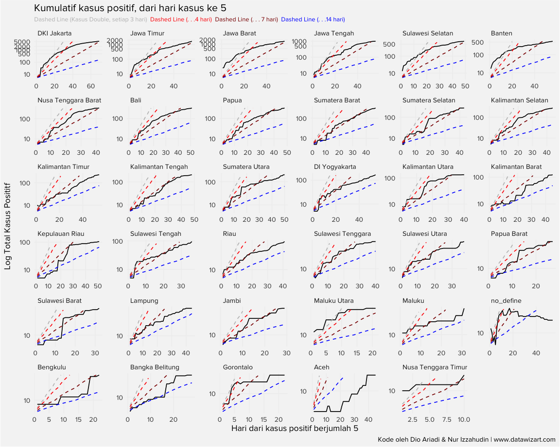
How positive cases progressed
The fourth chart plots cumulative cases on a log scale, starting from the day a province passed 4 cases. Guide lines show the doubling rate: where the black line runs parallel to a guide, cases are doubling over that guide’s interval.
Code
label_case=
  bind_rows(data.frame(value = seq_fun(start_value = 5, end_value = max(df_indo$total_case), 3), double_each = 3) %>% mutate(seq_ = row_number()-1),
            data.frame(value = seq_fun(start_value = 5, end_value = max(df_indo$total_case), 2), double_each = 2) %>% mutate(seq_ = row_number()-1),
            data.frame(value = seq_fun(start_value = 5, end_value = max(df_indo$total_case), 7), double_each = 7) %>% mutate(seq_ = row_number()-1),
            data.frame(value = seq_fun(start_value = 5, end_value = max(df_indo$total_case), 4), double_each = 4) %>% mutate(seq_ = row_number()-1),
            data.frame(value = seq_fun(start_value = 5, end_value = max(df_indo$total_case), 14), double_each = 14) %>% mutate(seq_ = row_number()-1))

label_case <- label_case %>% pivot_wider(names_from = double_each,values_from = value)

case_cumulative <- heatmap_indo %>% filter( total_case>4 & province!="no_defined") %>%
  group_by(province) %>%
  arrange(data_date) %>%
  mutate(seq_ = row_number())  %>%
  ungroup() %>%
  group_by(province,total_case) %>%
  mutate(seq_1 = row_number()) %>% ungroup()
case_cumulative <- case_cumulative %>% left_join(label_case,by = c("seq_"))
case_cumulative <- case_cumulative %>%
  group_by(province) %>%
  mutate(`3` = ifelse(`3`>max(total_case),NA,`3`),
         `2` = ifelse(`2`>max(total_case),NA,`2`),
         `7` = ifelse(`7`>max(total_case),NA,`7`),
         `4` = ifelse(`4`>max(total_case),NA,`4`),
         `14` = ifelse(`14`>max(total_case),NA,`14`))
case_cumulative %>%
  ggplot()+
  geom_line(aes(x=seq_,y=total_case) )+
  geom_line(aes(x = seq_,y = `3`) ,linetype="dashed",color="grey")+
  geom_line(aes(x = seq_,y = `14`),linetype="dashed",color="blue")+
  geom_line(aes(x = seq_,y = `4`) ,linetype="dashed",color="red")+
  geom_line(aes(x = seq_,y = `7`) ,linetype="dashed",color="darkred")+
  scale_y_continuous(trans='log2',
                     breaks=c(10,100,500,1000,2000,5000,10000,25000,80000,120000))+
  facet_wrap(~province,scales = "free")+
  labs(y = "Log Total Kasus Posititf", x = "Hari dari kasus positif berjumlah 5",
       caption = "Kode oleh Dio Ariadi & Nur Izzahudin | www.datawizart.co",
       title = "Kumulatif kasus positif, dari hari kasus ke 5",
       subtitle = "<span style='color:grey'>Dashed Line (Kasus Double, setiap 3 hari)</span> <span style='color:red'>Dashed Line (. . .4 hari)</span> <span style='color:darkred'>Dashed Line (. . . 7 hari)</span> <span style='color:blue'>Dashed Line (. . .14 hari)</span>")+
  theme(panel.background = element_rect(fill = "#f5f5f5"),
        text = element_text(family = "Proxima Nova"),
        panel.grid.major = element_line(colour = "#f0f0f0"),
        panel.grid.minor = element_blank(),
        axis.ticks = element_blank(),
        strip.background = element_rect(fill = "#f5f5f5"),
        plot.background = element_rect(fill = "#f5f5f5"),
        strip.text.x = element_text(hjust = 0),
plot.subtitle = element_markdown(size = 8))Cumulative Positive Cases, Log Scale
Cumulative cases on a log scale, with doubling-rate guide lines
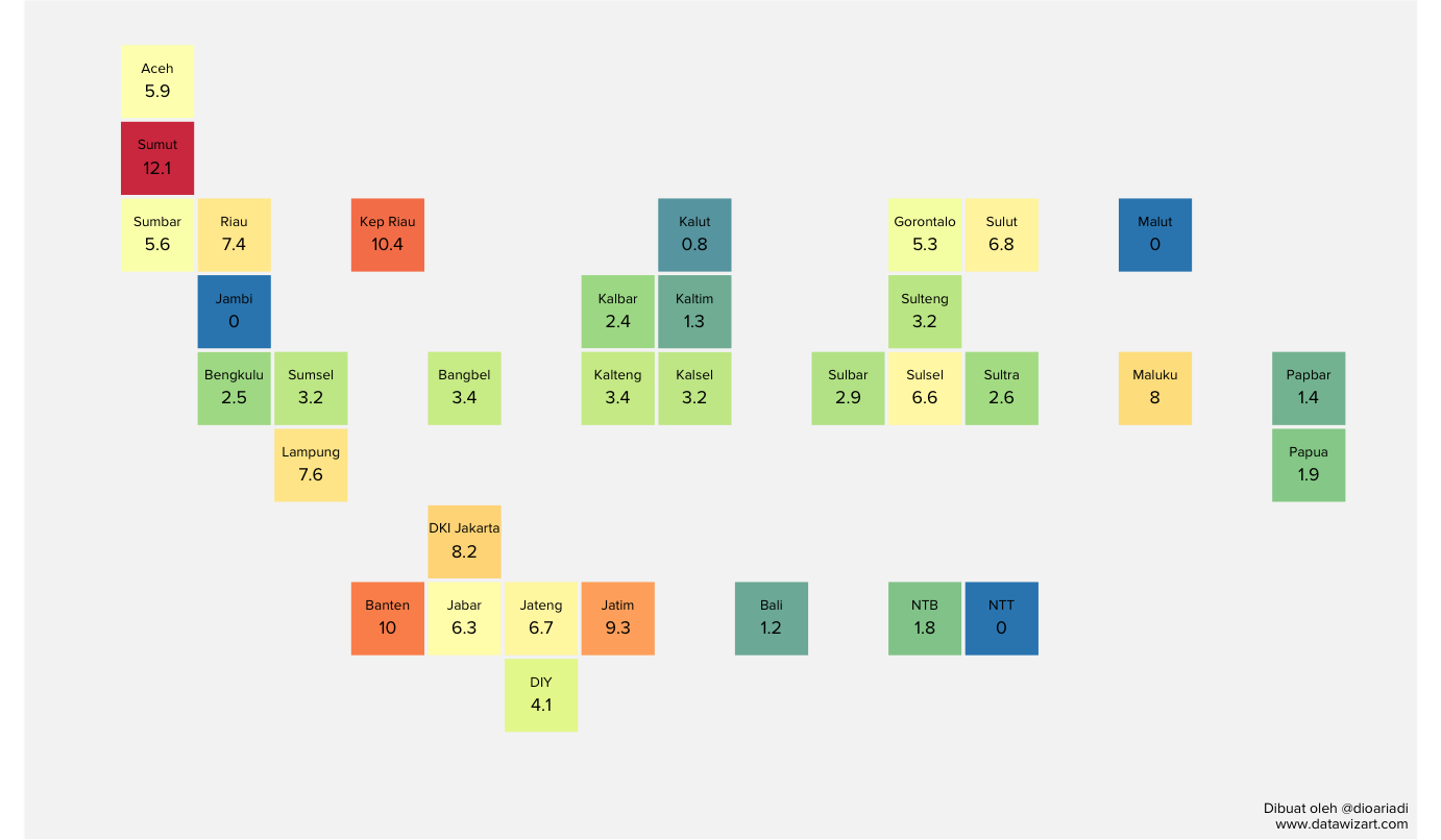
Death rate by province
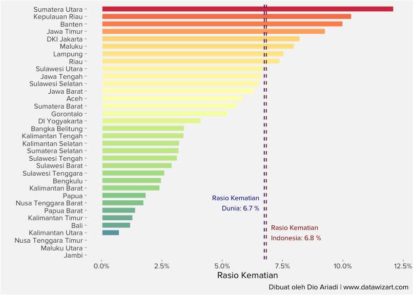
The death rate is defined as deaths divided by positive cases. The provinces with the highest death rates are concentrated on Java and Sumatra.
Code
death_ratio_df <- df_indo %>%
  group_by(code,province) %>%
  arrange(data_date) %>%
  mutate(rank_ = row_number(),
         n_ = n()) %>%
  filter(rank_ == n_) %>%
  ungroup() %>%
  mutate(death_ratio = total_death/total_case,
         death_ratio = ifelse(is.na(death_ratio),0,death_ratio)) %>%
  left_join(indo_grid[,c(1,2,5,6)], by = c("province"="name_indo"))

death_ratio_df %>%
  ggplot(aes(x = (col), y = -1*row,
             fill = death_ratio))+
  geom_tile(color = "#f5f5f5",size=1)+
  geom_text(aes(label=round(death_ratio,3)*100),vjust=1.2,family = "Proxima Nova")+
  geom_text(aes(label=name_short),vjust =-1,family = "Proxima Nova",size = 3)+
  labs(x = "",y= "", caption = "Dibuat oleh @dioariadi\nwww.datawizart.co")+
  coord_equal()+
  scale_fill_distiller(palette="Spectral")+
   theme(panel.grid = element_blank(),
        text = element_text(family = "Proxima Nova"),
        strip.background = element_blank(),
        axis.text.x = element_blank(),
        axis.ticks.x = element_blank(),
        strip.text.x = element_text(size = 7),
        axis.text.y = element_blank(),
        axis.ticks.y = element_blank(),
        plot.background=element_rect(fill = "#f5f5f5"),
        panel.background = element_rect(fill = "#f5f5f5"),
legend.position = "none")Death-Rate Map by Province
Geofacet grid — death rate (%) for each Indonesian province
Code
overall_indo <- sum(death_ratio_df$total_death)/sum(death_ratio_df$total_case)
overall_world <- read_rds("df_worldmeter_analysis.rds") %>% group_by(country) %>% slice(which.max(data_date)) %>% ungroup() %>% summarise(sum(deaths,na.rm = TRUE)/sum(cases,na.rm = TRUE)) %>% pull()

death_ratio_df %>% filter(province!="no_define") %>%
  ggplot(aes(x = fct_reorder(province,death_ratio),
             y = death_ratio,
             fill = death_ratio))+
  geom_col(color = "#f5f5f5",size=1)+
  geom_hline(aes(yintercept= overall_indo),linetype ="dashed",color = "darkred")+
  geom_hline(aes(yintercept= overall_world),linetype ="dashed",color = "darkblue")+
  #geom_text(aes(x = 4, y = 0.082, label = paste("Rasio Kematian\n Indonesia:",round(overall_indo,3)*100)), family= "Proxima Nova",size =3)+
  annotate("text", x = 4, y = overall_indo+0.002, label = paste("Rasio Kematian\nIndonesia:",round(overall_indo,3)*100,"%"),family = "Proxima Nova",
           size=3,
           colour ="darkred",
           hjust = 0)+
    annotate("text", x = 8, y = overall_world-0.002, label = paste("Rasio Kematian\nDunia:",round(overall_world,3)*100,"%"),family = "Proxima Nova",
           size=3,
           colour ="darkblue",
           hjust = 1)+
  labs(x = "",
       y = "Rasio Kematian",
       caption = "Dibuat oleh Dio Ariadi | www.datawizart.co")+
  coord_flip()+
  scale_fill_distiller(palette="Spectral")+
  scale_y_continuous(labels = scales::percent)+
   theme(panel.grid = element_blank(),
        text = element_text(family = "Proxima Nova"),
        strip.background = element_blank(),
        axis.ticks.x = element_line(colour = "grey"),
        strip.text.x = element_text(size = 7),
        axis.ticks.y = element_line(colour = "grey"),
        plot.background=element_rect(fill = "#f5f5f5"),
        panel.background = element_rect(fill = "#f5f5f5"),
legend.position = "none")Death Rate by Province
Ranked highest first, with reference lines for the world (6.7%) and Indonesia (6.8%) death rates
Code
  #geom_text(aes(label=round(death_ratio,3)*100),vjust=1.2,family = "Proxima Nova")+
  #geom_text(aes(label=name_short),vjust =-1,family = "Proxima Nova",size = 3)
Can any conclusion be drawn from the charts above?
Any conclusion is left to the reader. For reference, deaths in Jakarta rose 52% against the previous year’s average.
Feedback
Email dioariadi11@gmail.com
Appendix
Contributors
PSBB dates (large-scale social restrictions)
Data sources
- Indonesia: @kawalCOVID19 · https://covid19.go.id/
- International: worldmeters